When engaging in the business of trading forex, you will encounter a dizzying array of charts that represent the happenings in the market over a specific period of time.
Charts are very important in currency trading because they assist in presenting the exchange rates in a visual and organized manner.
Forex charting is the basis of technical analysis. This is because technical analysis entails studying price movements in the forex market by looking at patterns and trends made by the charts.
There are two integral parameters in forex chart: the X axis that represents time and the y axis that represents price.
There are three common types of charts that are used in online forex trading:
- Line charts
- Bar charts
- Candlestick charts
Line charts
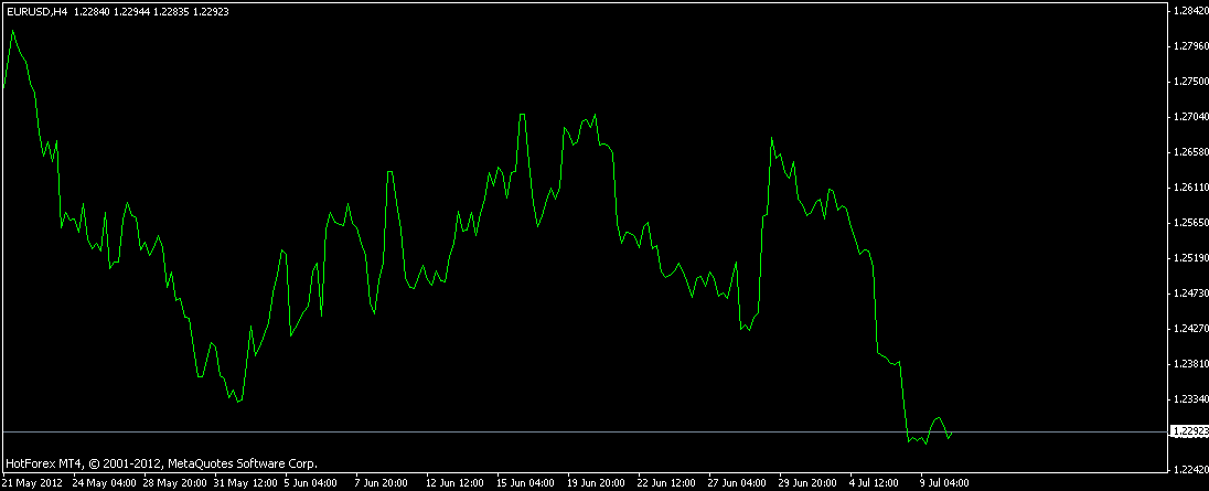
Line charts are the simplest types of charts. A simple line chart draws a line that connects one closing price to the next closing price; therefore, it gives a good snapshot of the behavior of a currency pair.
When connected together with a line, traders can visualize the general price movement of a currency pair over several minutes, hours, days, or weeks.
It is of essence to note that the majority of traders put more emphasis on the closing price of a currency pair. As such, the line chart can enable you to have a very beneficial view of market movement over a period of time.
Here is an example of a line chart for EUR/USD:
Bar Charts
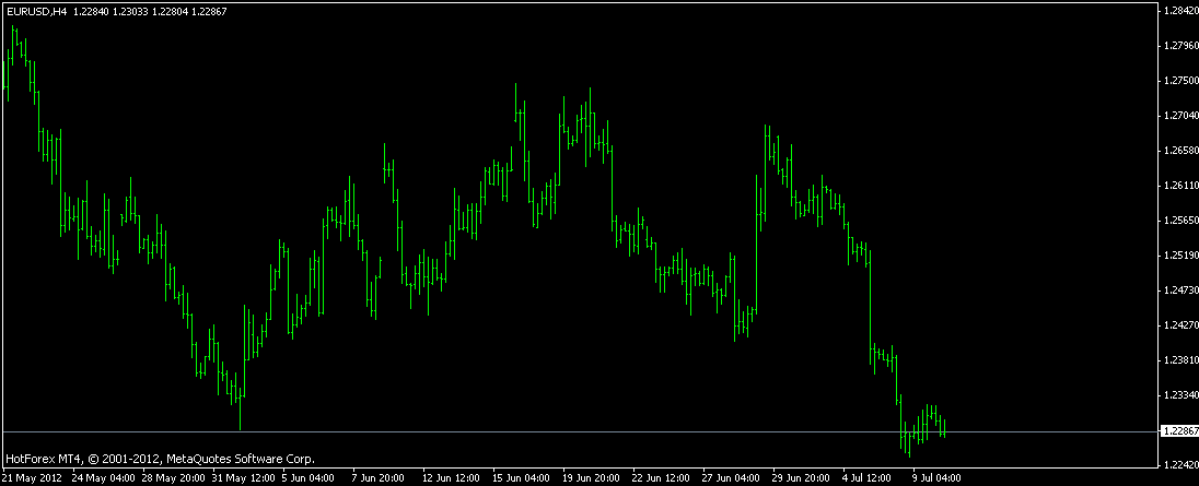
Bar charts are a more in-depth method of representing movements in the forex market since they provide more information than the line charts. They not only give the closing price, but they also give the opening price, highest price, as well as the lowest price for whatever time the user chooses.
For instance, if a user chooses a 30 minutes chart, it implies that each price movements within 30 minutes period are shown by 1 single bar.
The bottom of the vertical bar shows the lowest price that the particular currency pair traded during the time period while the top of the bar shows the highest price that the particular currency pair traded during that time period.
The vertical bar shows the entire trading range of price over the time period chosen by the user. An opening hash on the left side of the bar gives the currency pair’s opening price while a closing hash on the right side of the bar gives the currency pair’s closing price.
Bar charts are also referred to as “OHLC” charts, as they give the Open, the High, the Low, and the Close prices for that particular currency within the chosen time frame.
Here is an example of a bar price:
Open: The little horizontal line on the left is the opening price
High: The top of the vertical line defines the highest price of the time period
Low: The bottom of the vertical line defines the lowest price of the time period
Close: The little horizontal line on the right is the closing price
Here is the same chart for EUR/USD used in the line chart explanation but in a bar chart form:
Candlestick Charts
Candlestick charts are the most common type of charts used in forex trading. Essentially, they provide the same information as bar charts but in a pictorial representation that is more appealing to the eye.
Candlestick charts give the high-to-low range of a particular currency pair with a vertical line depending on the time frame chosen, just like in bar charts.
However, the main difference is that in candlestick charts the larger block (or real body) in the middle represents the range between the opening and closing prices.
Traditionally, if the larger block is filled or solid in color, then it implies that the closing price of the currency pair is lower than its opening price.
On the other hand, if the larger block is left unfilled, or normally just white, then it implies that the closing price of the currency pair is higher than its opening price.
The top of the vertical line is referred to as the upper shadow. The bottom of the vertical line is referred to as the lower shadow. In other instances, the upper and the lower shadows may be called “wicks”.
Therefore, if the larger block is filled, then the top of the larger block represents the opening price and the bottom of the larger block represents the closing price.
If the larger block is not filled with any color, then the top of the larger block represents the closing price and the bottom of the larger block represents the opening price.
The following illustration adds more weight to the above explanation:
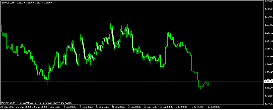
Here is the same chart for EUR/USD used in the line chart and bar chart explanation but in a candlestick chart form:
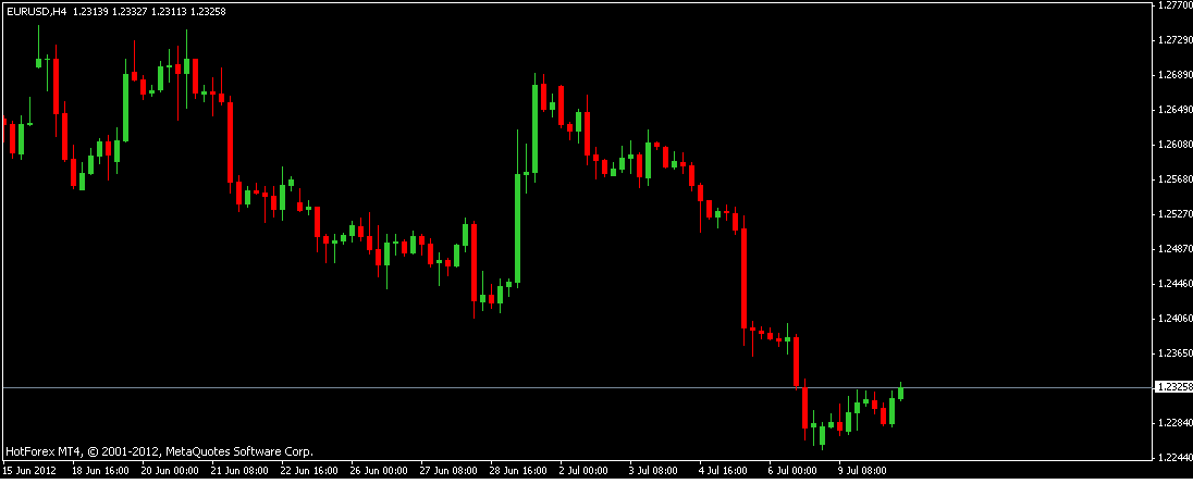
If color is added on the candlestick chart above, it becomes more attractive and, more so, easier to spot trading opportunities.
Green and red are usually used as alternate colors. Green, which is substituted for the white candlestick, is a bullish candle; that is, the closing price is higher than the opening price.
Red, which is substituted for the black candle, is a bearish candle; that is, the closing price is lower that the opening price.
Candlestick charts are loved by most forex traders because of the following reasons:
- They are easy to interpret. Thus, they offer an excellent way for beginners who want to do technical analysis.
- They are easy to use. Because candlestick charts serve as visual aids, it is easy to spot patterns on them than the other types of charts.
- They are good at helping traders identify marketing turning points. In forex trading, reversals usually take place, for example from an uptrend to a downtrend or vice versa. And, this is where candlestick charts are of great help.
Summary
Forex charting is very important in currency trading because they help in presenting the exchange rates in a visual and organized manner.
The three common types of charts used in the foreign exchange market are line charts, bar charts, and candlestick charts. Whichever you choose for your trading, you should understand how it operates.


